Web Awesome (ViUR)

Font Awesome
Try SSR Server-side rendering (SSR) generates component HTML on the server before the page loads, improving SEO and initial load time. Use the switch to see Web Awesome components render with and without SSR.
Search this website ⌘KCtrl+K Light Dark System Docs Select Color Scheme Default Awesome Shoelace Active Brutalist Glossy Matter Mellow Playful Premium Tailspin Docs Select Theme View Project on GitHub Star Project on GitHub
Start Components Docs Help
Web Awesome Font Awesome Build Awesome
Search this site… /
Try SSR Server-side rendering (SSR) generates component HTML on the server before the page loads, improving SEO and initial load time. Use the switch to see Web Awesome components render with and without SSR.
Light Dark System Docs Select Color Scheme Default Awesome Shoelace Active Brutalist Glossy Matter Mellow Playful Premium Tailspin Docs Select Theme

Getting Started

  • Installation
  • Usage
  • Forms
  • Localization
  • Frameworks
  • Using with AI
  • Figma Design Kit ProThis requires access to Web Awesome Pro
  • Server Rendering

Resources

  • Accessibility
  • Browser Support
  • Contributing
  • Patterns ProPatterns require access to Web Awesome Pro
  • Migrating from Shoelace
  • Visual Tests
  • Changelog
  • Help & Support

Theming & Utilities

  • Overview
  • Built-in Themes
  • Color Palettes
  • Design Tokens
  • Customizing & Theming
  • CSS Utilities

ViUR Components

  • Alert
  • Combobox
  • Pagination
  • Table Wrapper

Actions

  • Button
  • Button Group
  • Copy Button
  • Dropdown
    • Dropdown Item

Forms

  • Checkbox
  • Checkbox Group
  • Color Picker
  • Input
  • Known Date
  • Number Input
  • Radio Group
    • Radio
  • Rating
  • Select
    • Option
  • Slider
  • Switch
  • Textarea
  • Time Input
  • Data Grid Planned A Web Awesome Kickstarter stretch goal!

Layout

  • Accordion
    • Accordion Item
  • Card
  • Details
  • Dialog
  • Divider
  • Drawer
  • Page
  • Scroller
  • Split Panel

Navigation

  • Breadcrumb
    • Breadcrumb Item
  • Tab Group
    • Tab
    • Tab Panel
  • Tree
    • Tree Item

Feedback

  • Badge
  • Callout
  • Progress Bar
  • Progress Ring
  • Skeleton
  • Spinner
  • Tag
  • Tooltip

Media

  • Animated Image
  • Avatar
  • Carousel
    • Carousel Item
  • Comparison
  • Icon
  • Markdown
  • QR Code
  • Zoomable Frame

Data Viz

  • Advanced Usage

Helpers

  • Animation
  • Format Bytes
  • Format Date
  • Format Number
  • Include
  • Intersection Observer
  • Mutation Observer
  • Popover
  • Popup
  • Random Content
  • Relative Time
  • Resize Observer

Theming

  • Key Concepts
  • Themes
  • Color Palettes
  • Variants
  • Light & Dark Mode
  • Using Themes
  • Creating Your Own
  • Quick Reference
On This Page...
  • Key Concepts
  • Themes
  • Color Palettes
  • Variants
  • Light & Dark Mode
  • Using Themes
  • Creating Your Own
  • Quick Reference

Theming

Web Awesome themes apply a cohesive look and feel across the entire library, built from stackable layers — a theme, a color palette, variants, and a light or dark color scheme — that you mix and match with classes on the <html> element.

Try it live! Use the Theme and Color Scheme selectors in this site's header to preview themes or switch light/dark modes.

Key Concepts

Link to This Section

Themes

Link to This Section

.wa-theme-{name}

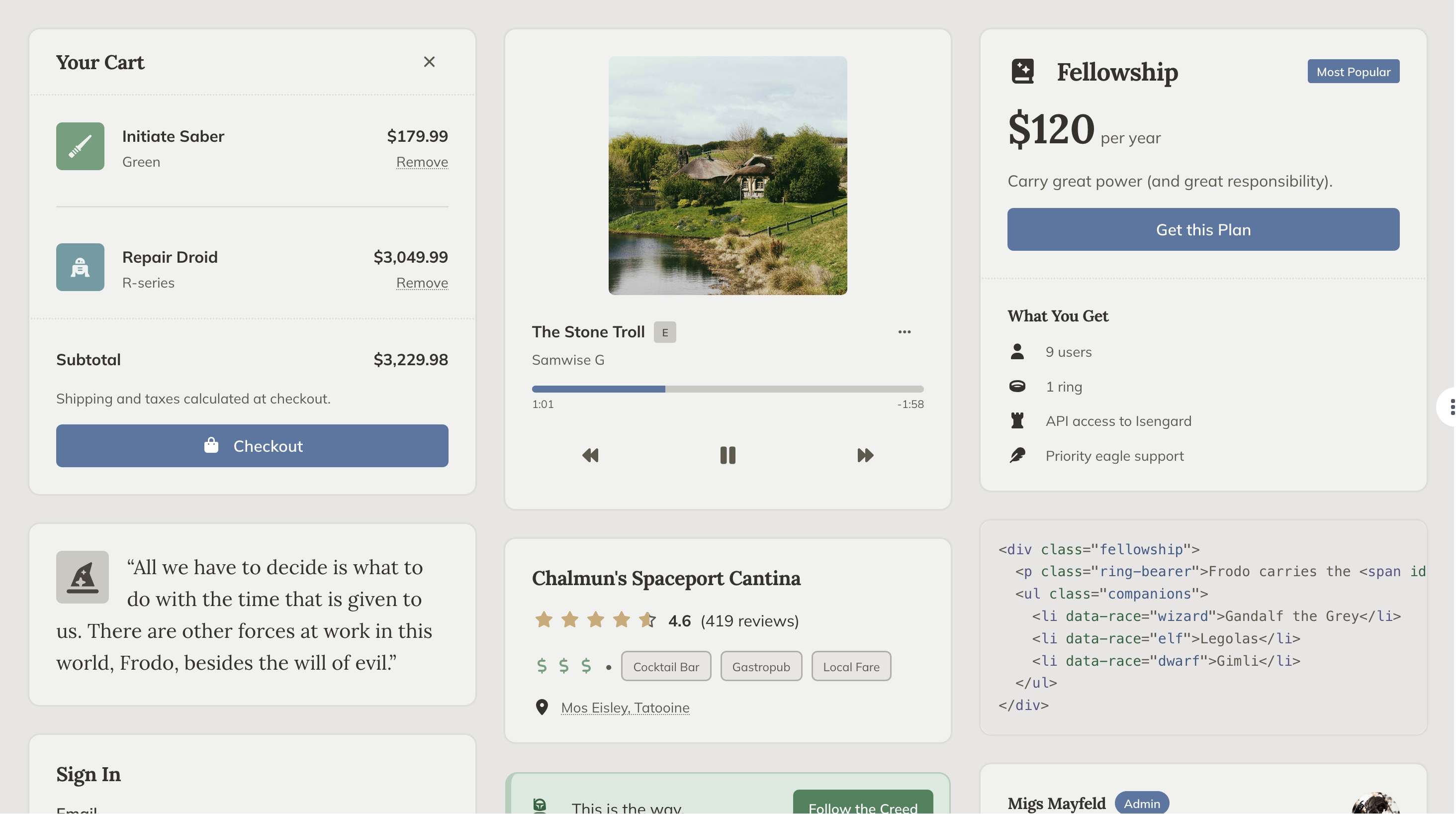
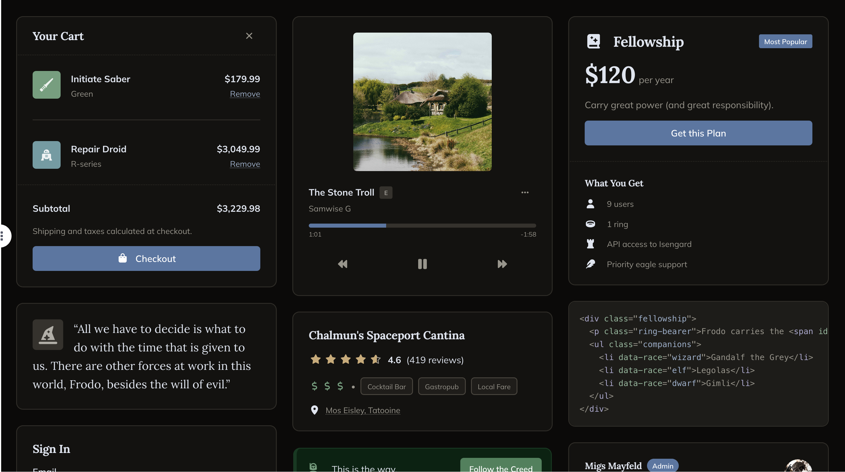
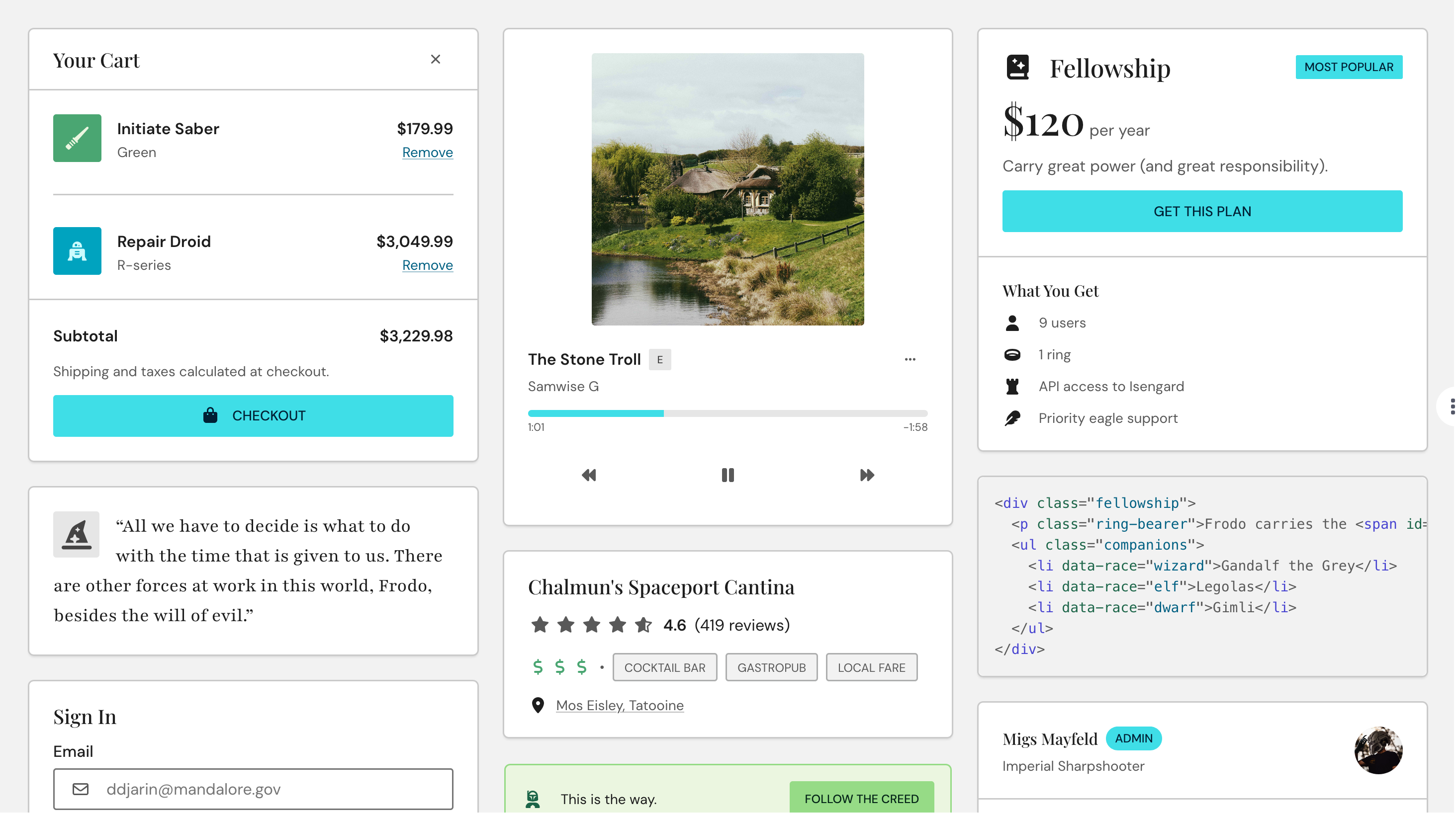
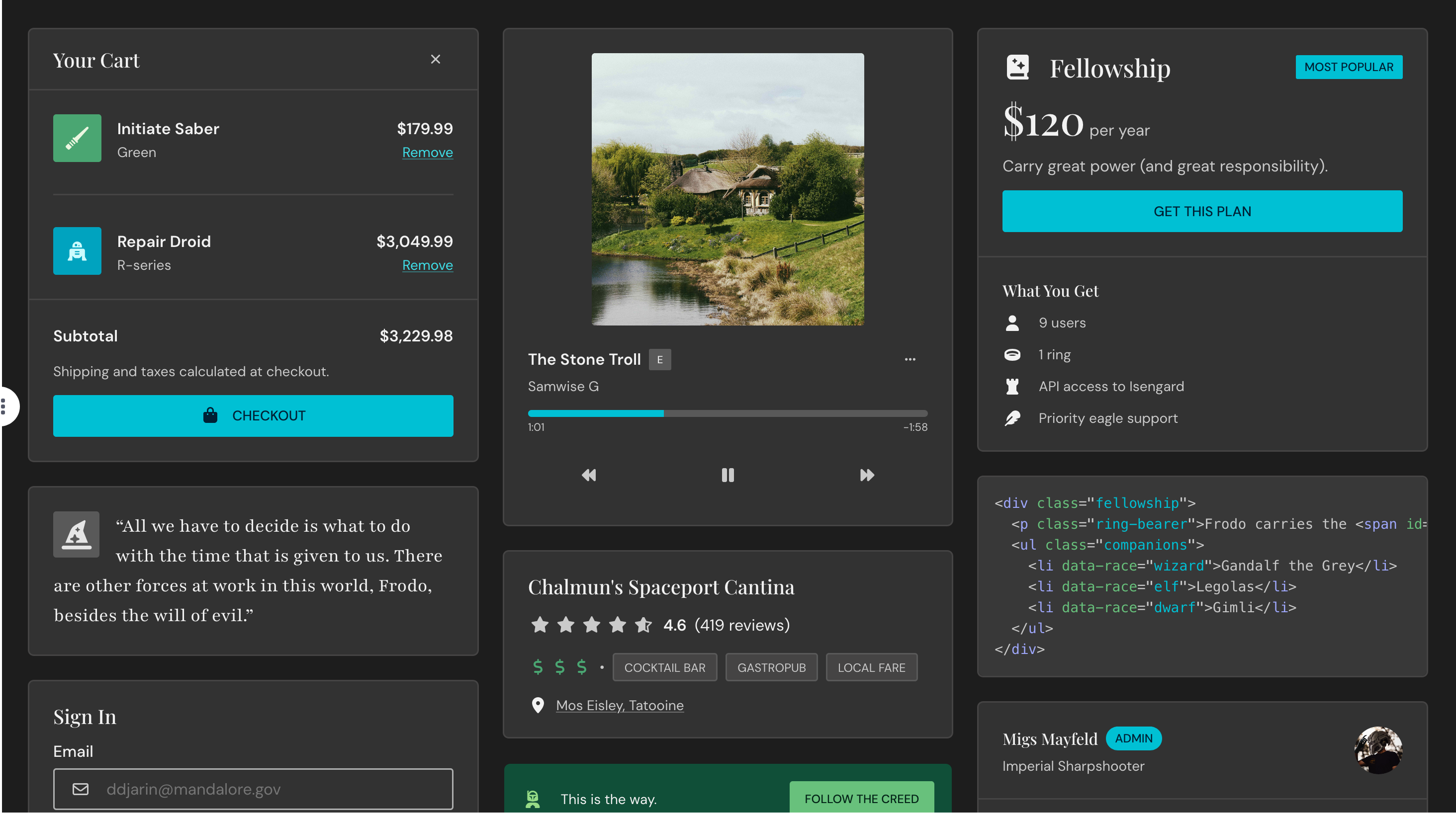
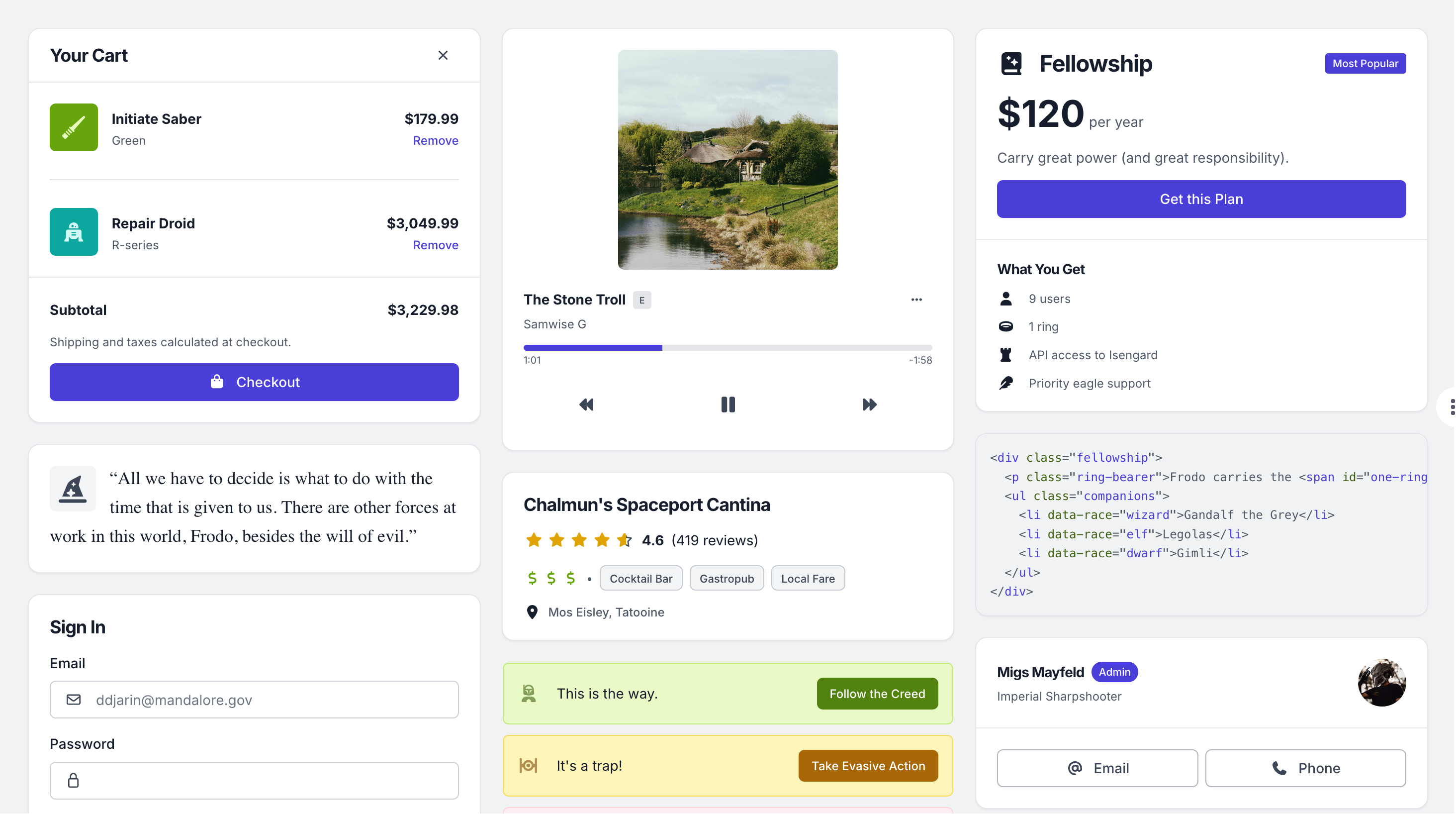
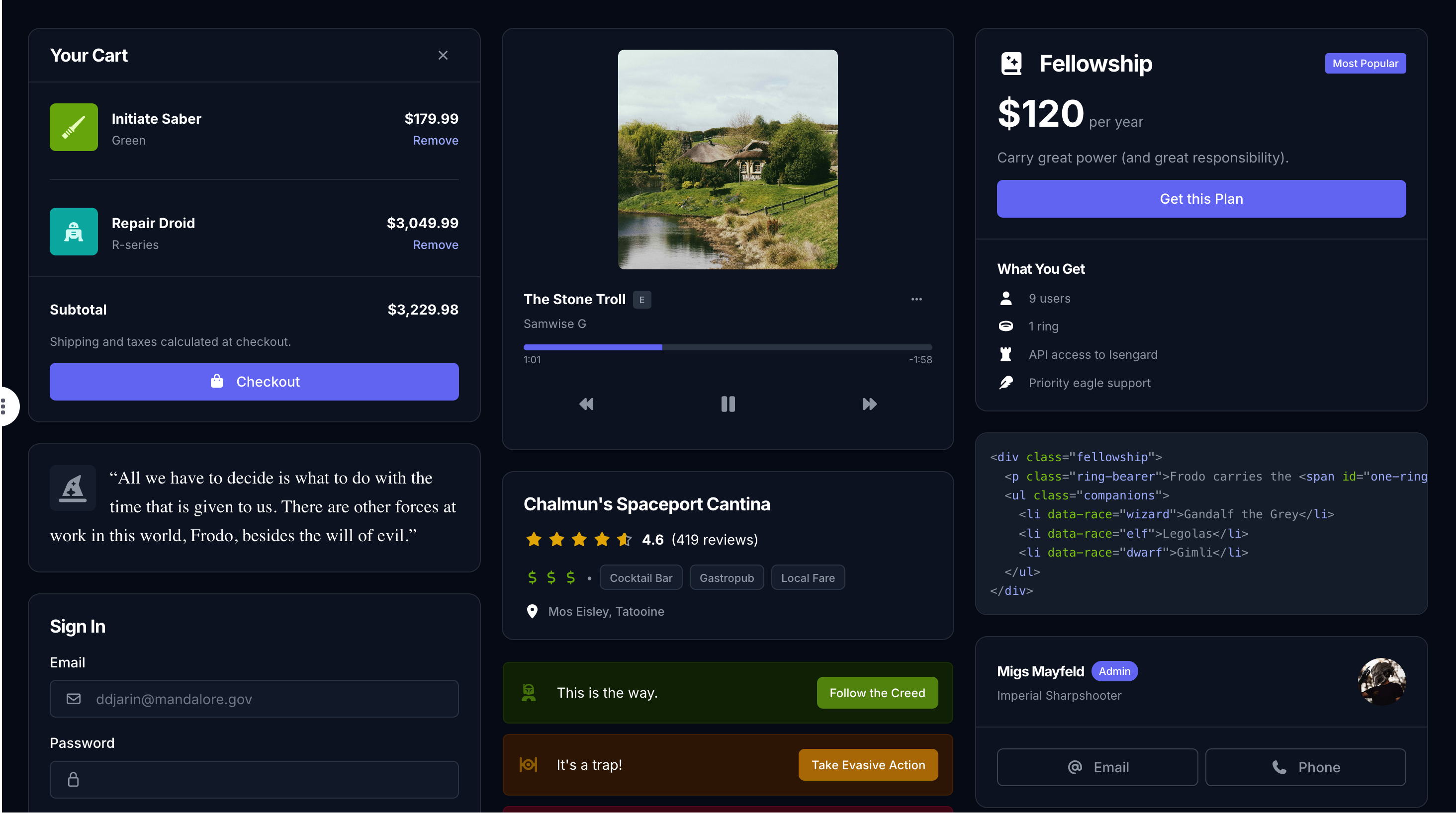
A theme is the overall look — fonts, borders, space, shadows, and how each variant gets used across components. Two themes can share a palette and variants and still feel completely different. Themes ship with a default palette and may include custom CSS overrides for individual components.
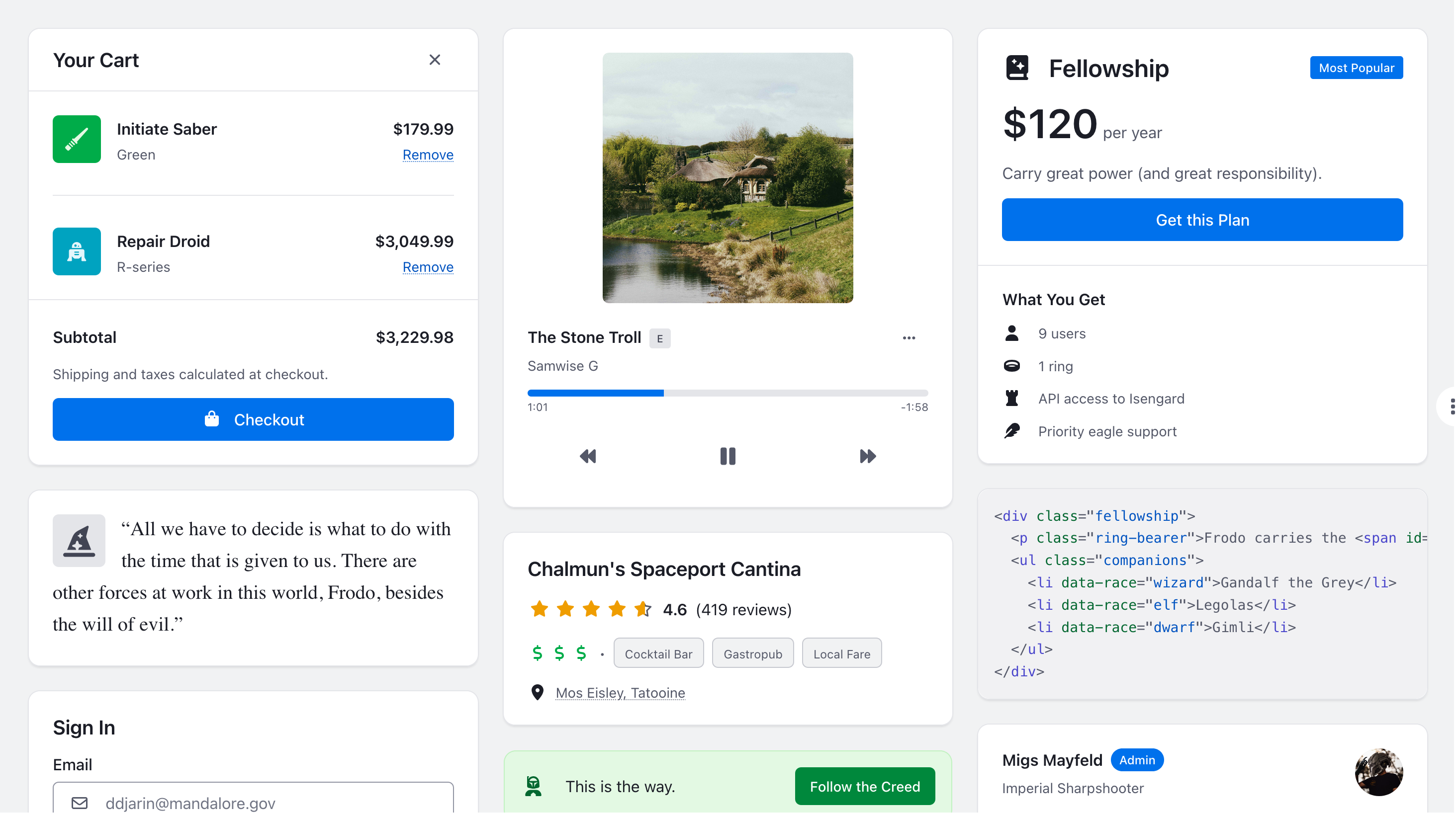
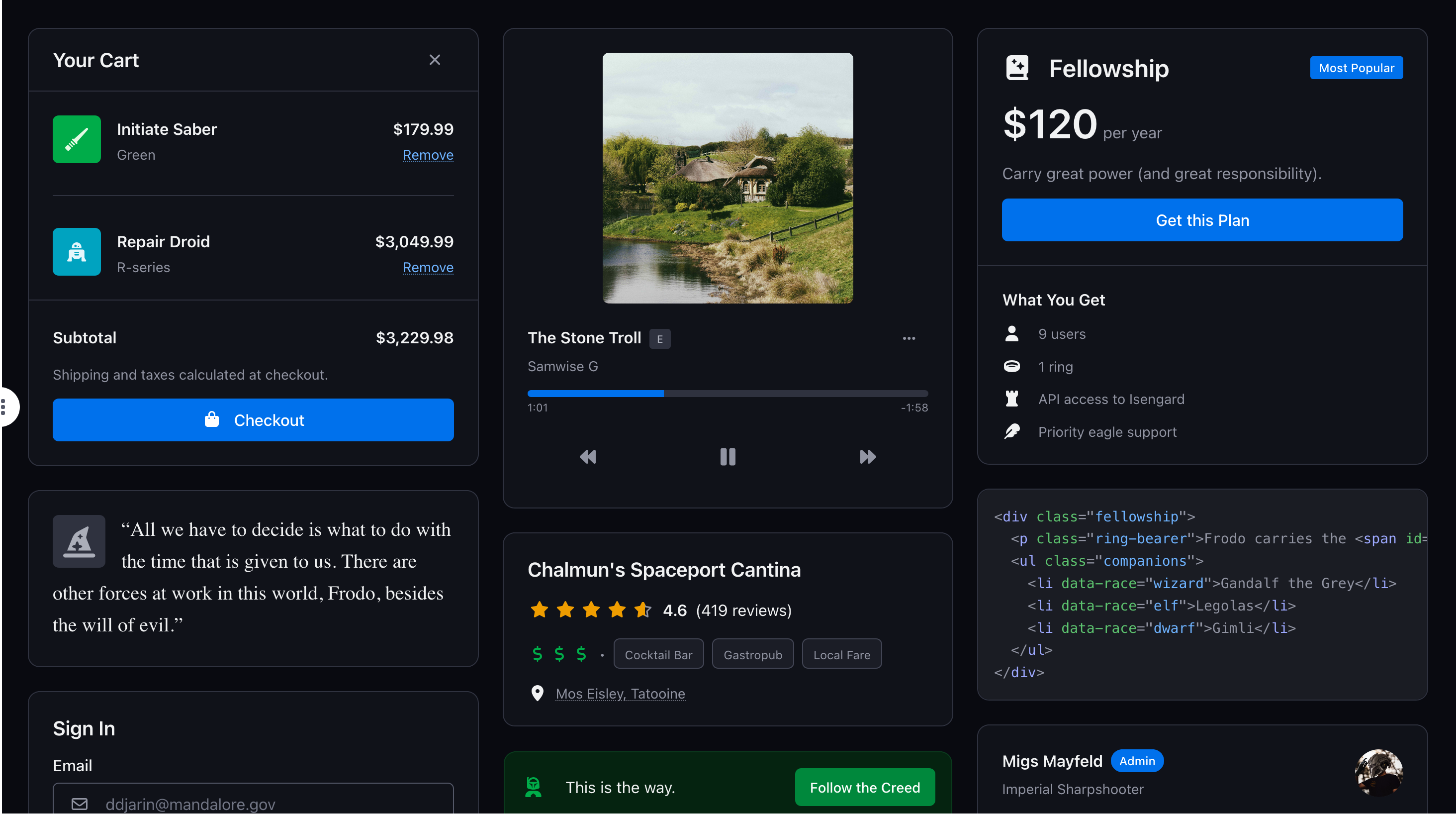
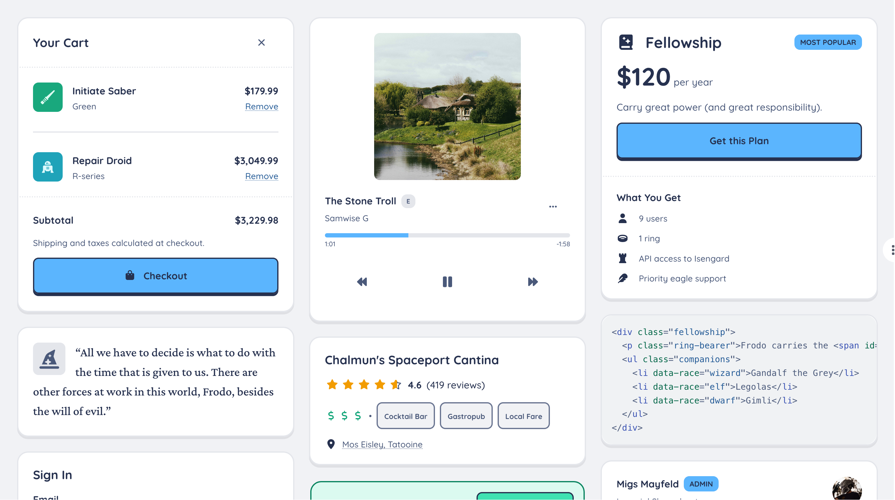
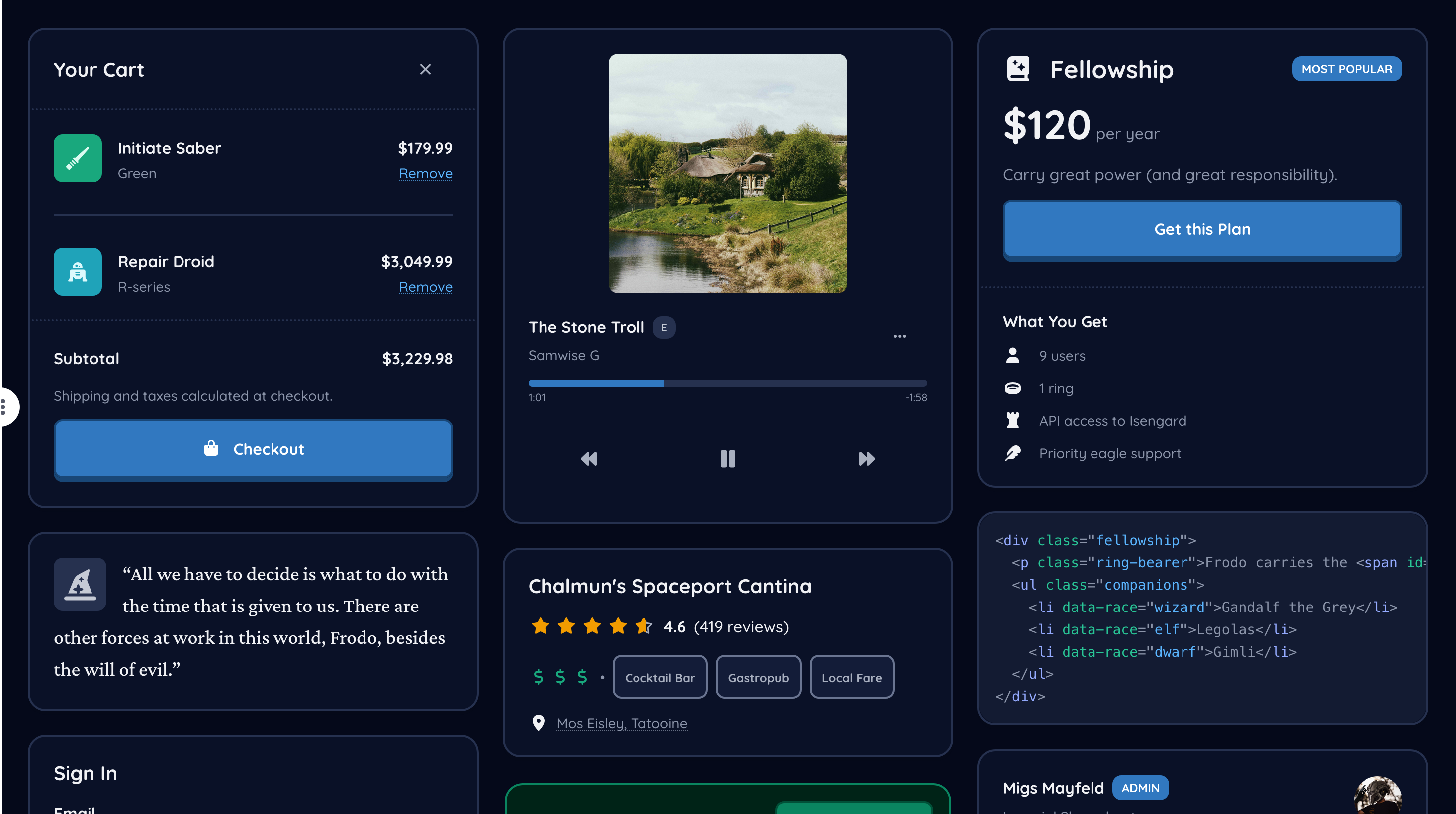
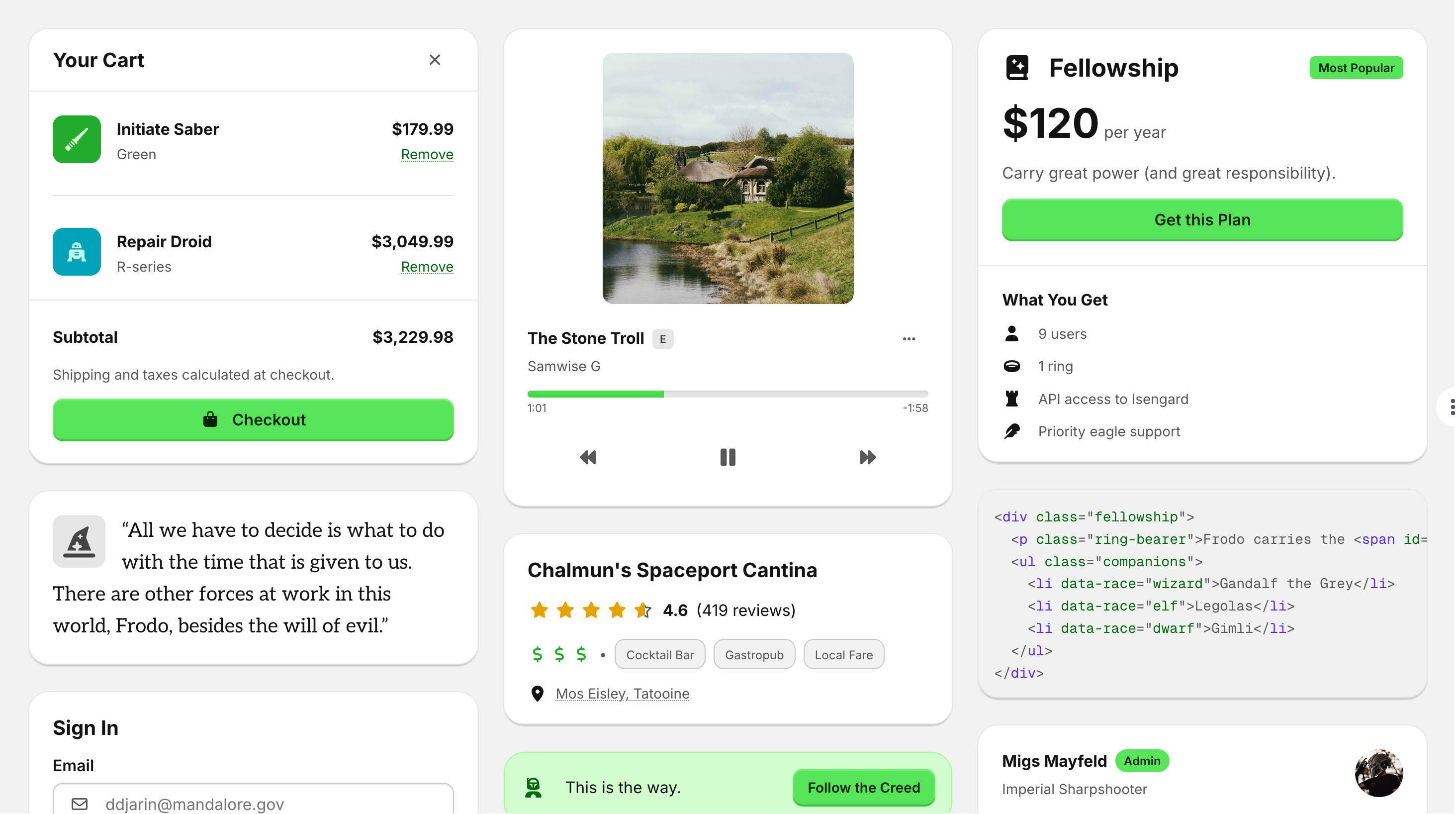
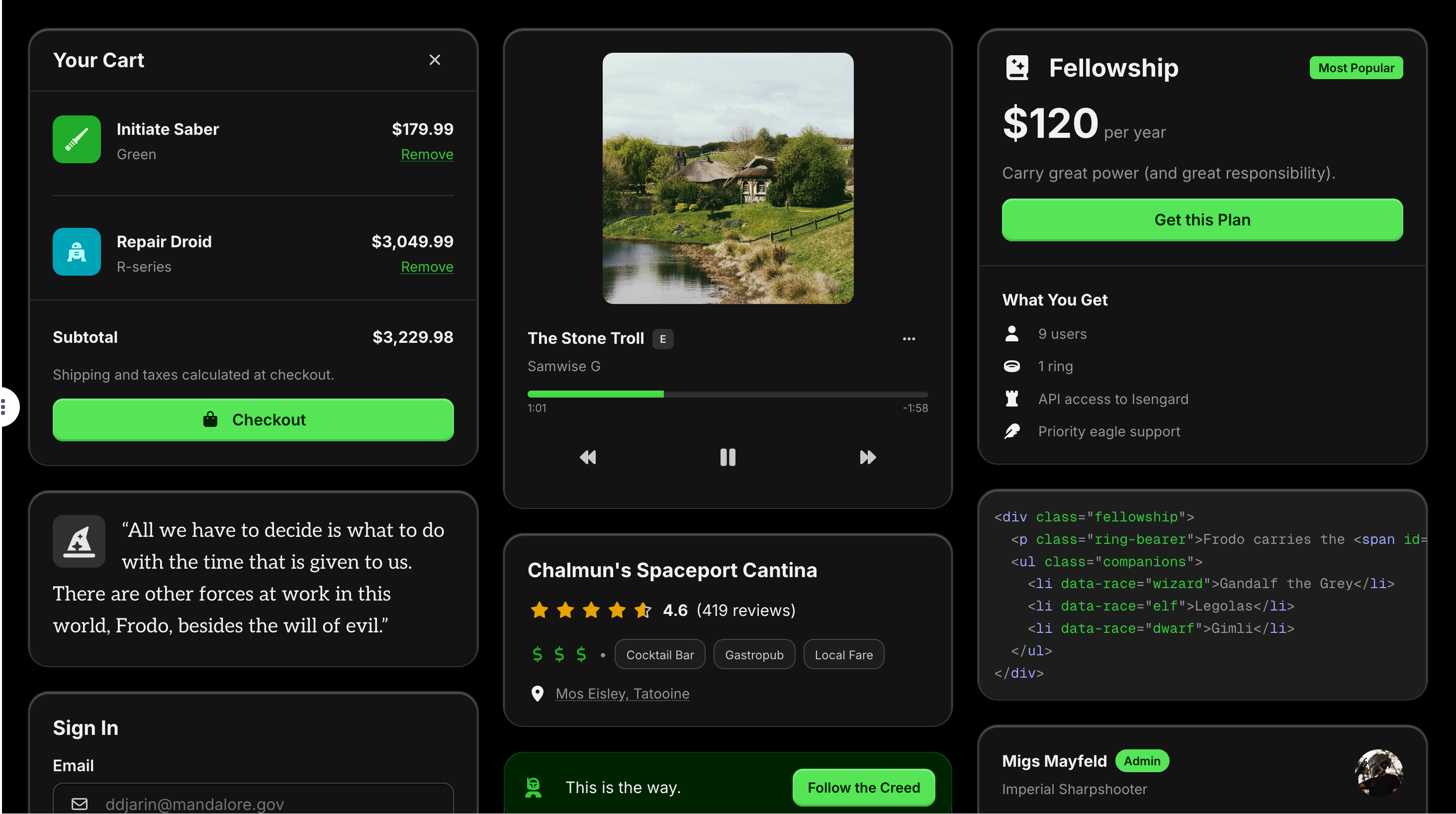
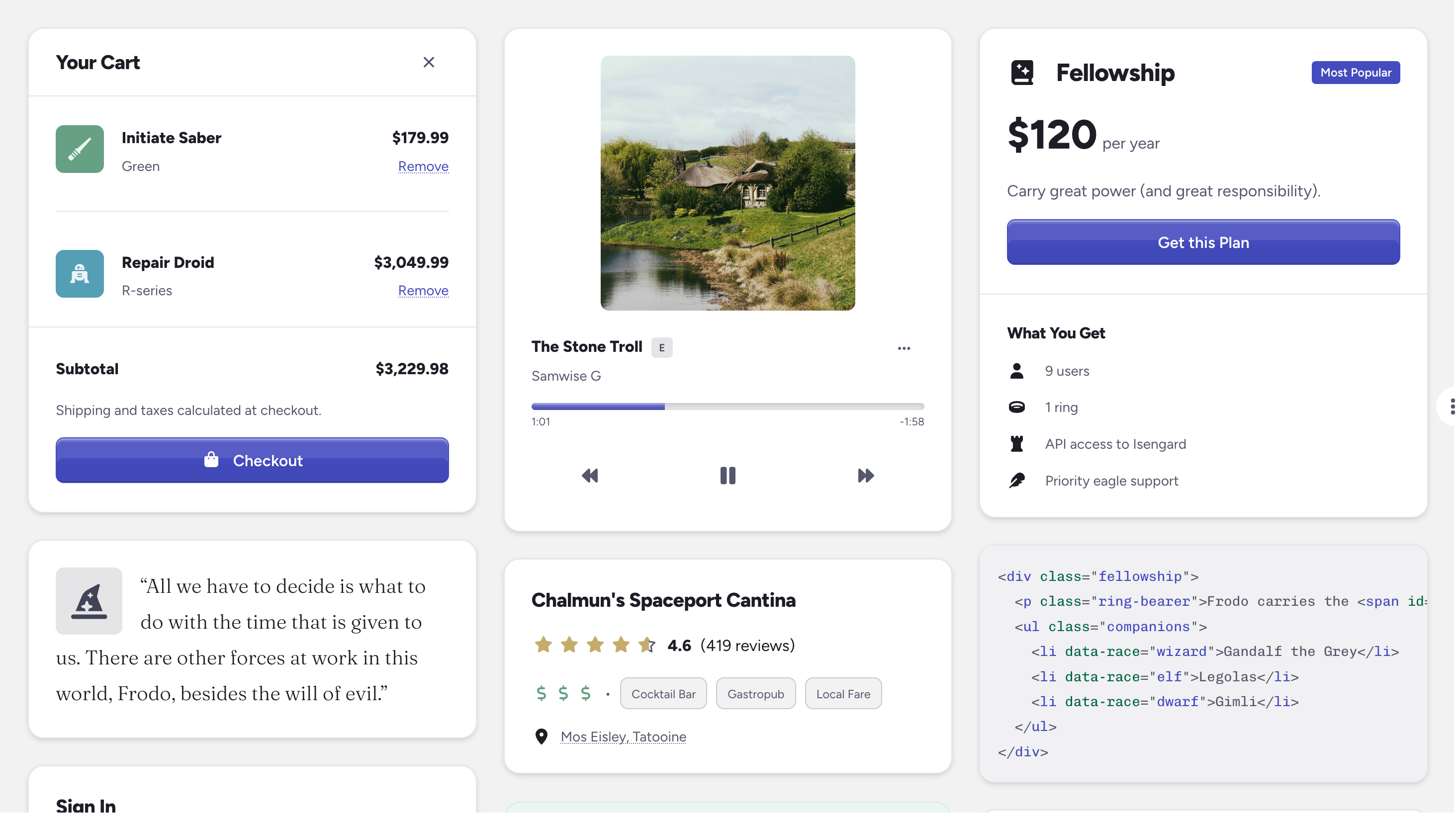
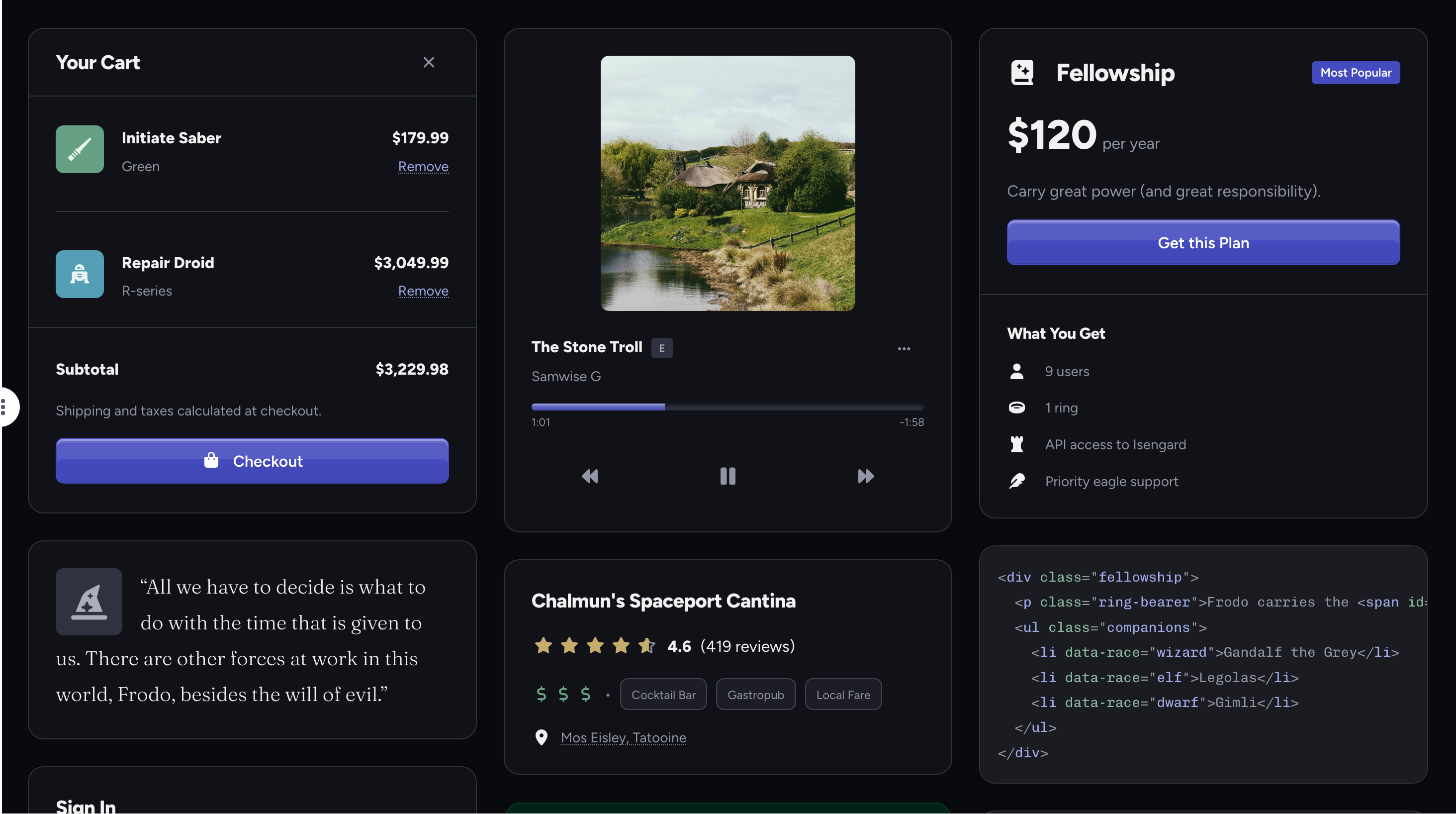
Default theme preview (light) Default theme preview (dark)
Default

Your trusty companion, like a perfectly broken-in pair of jeans.

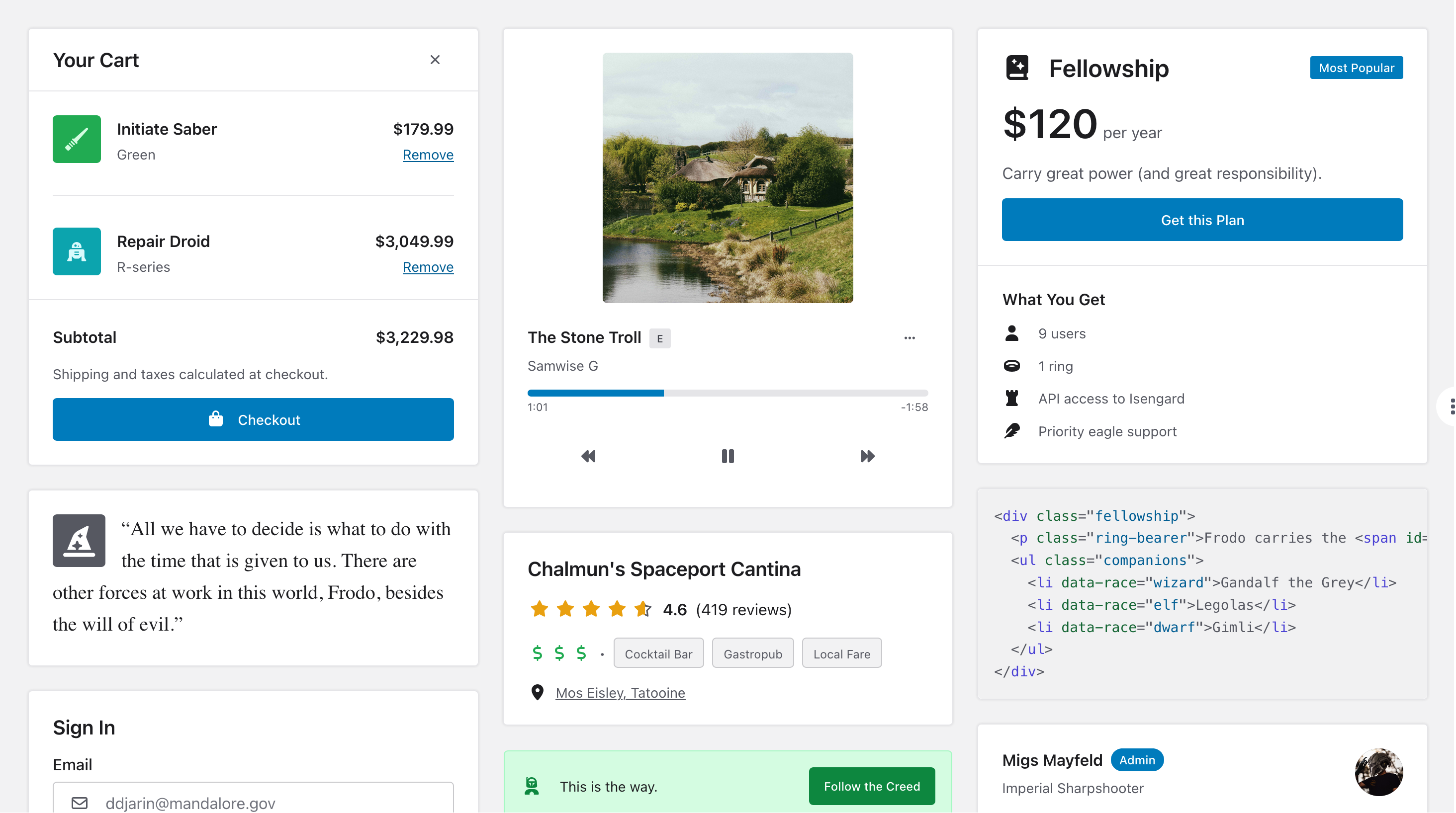
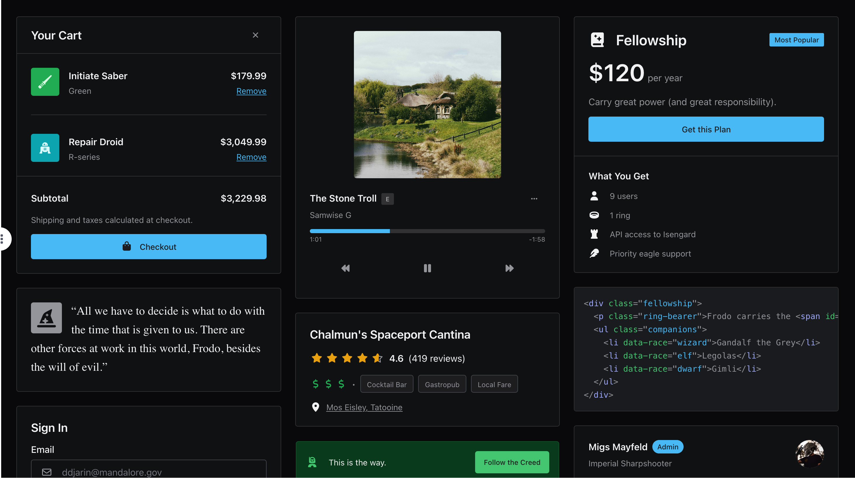
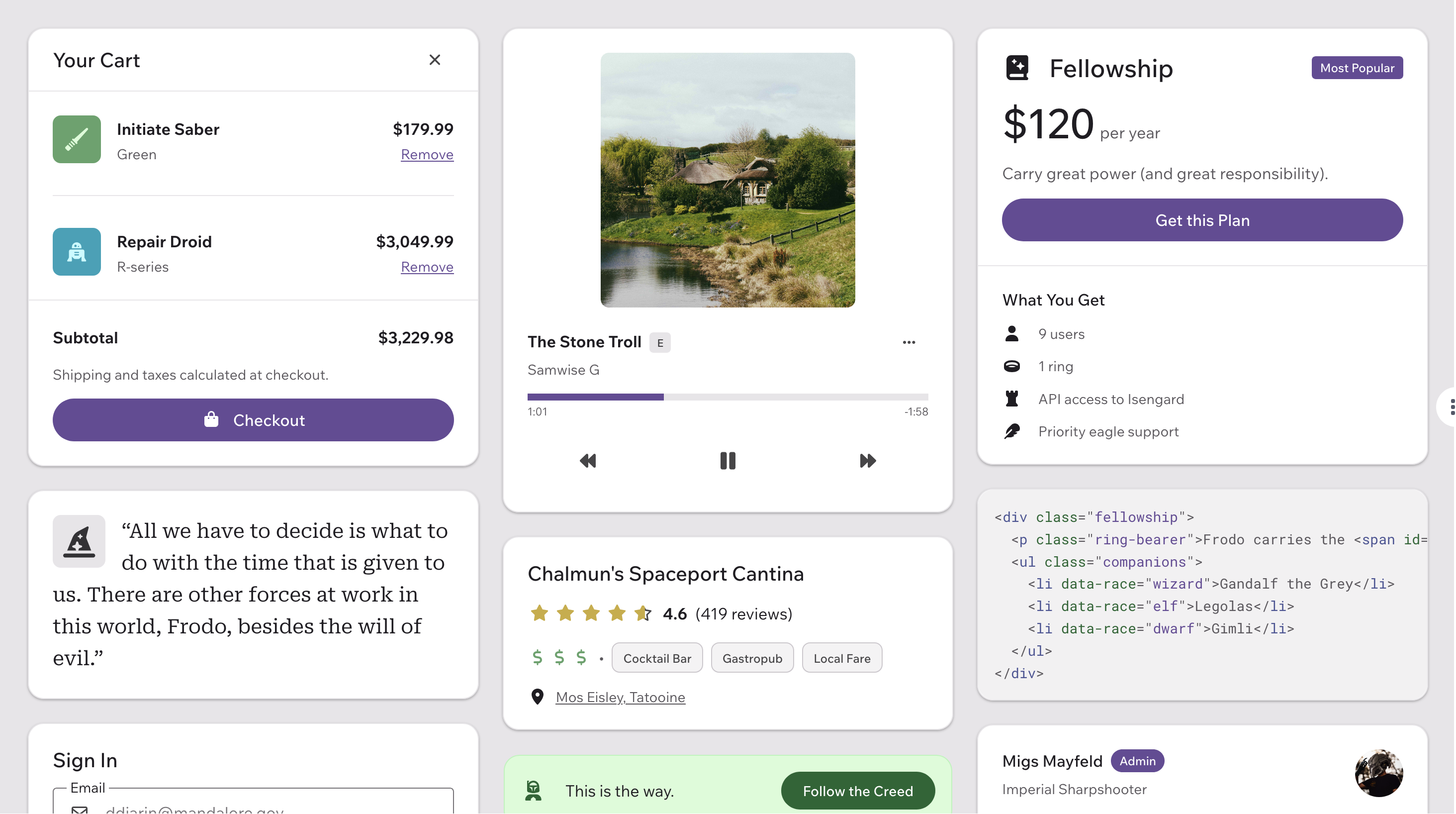
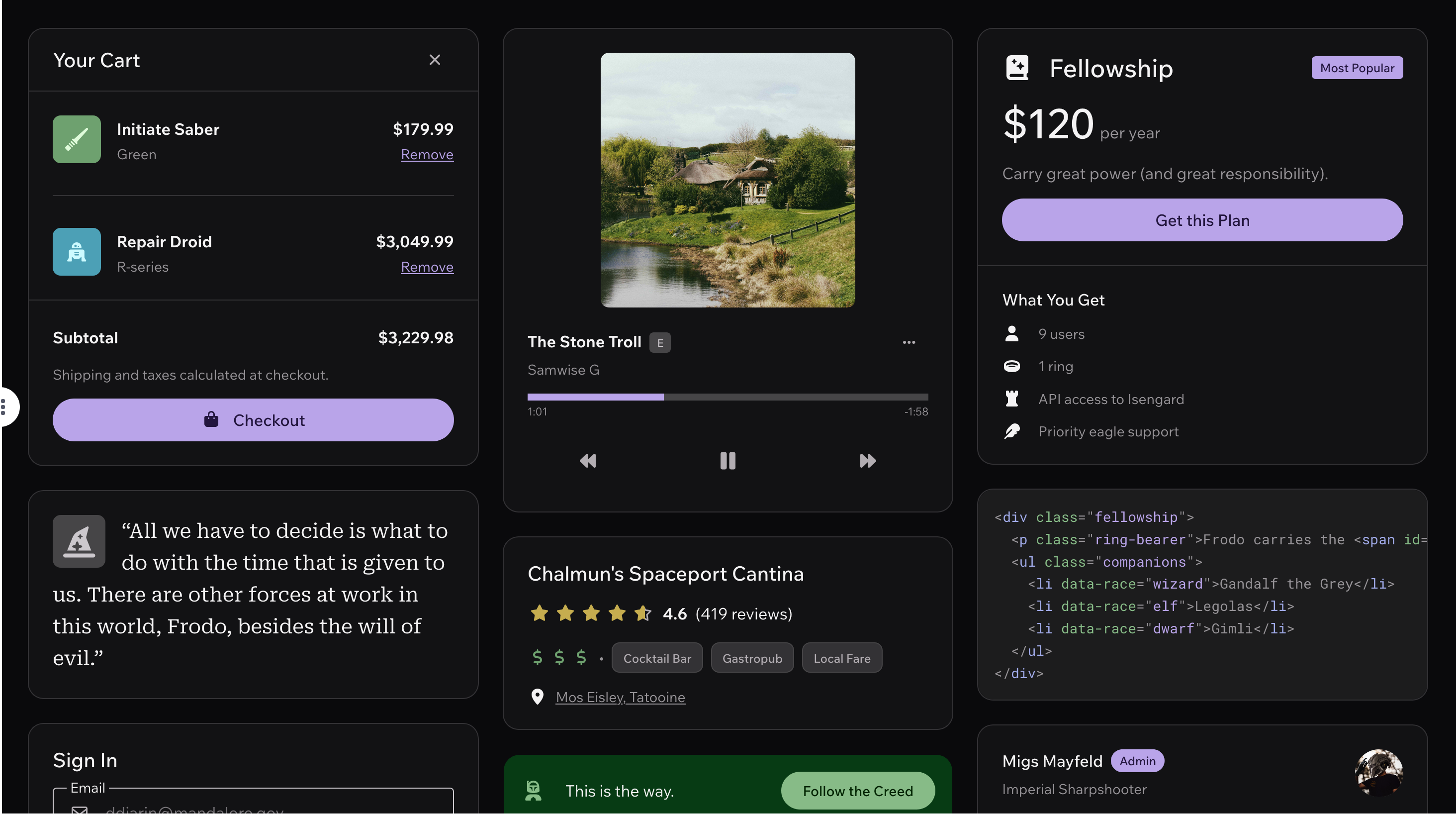
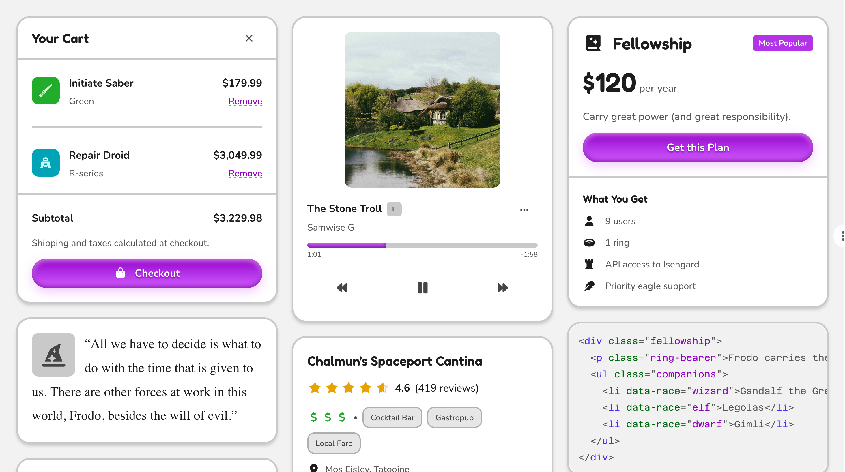
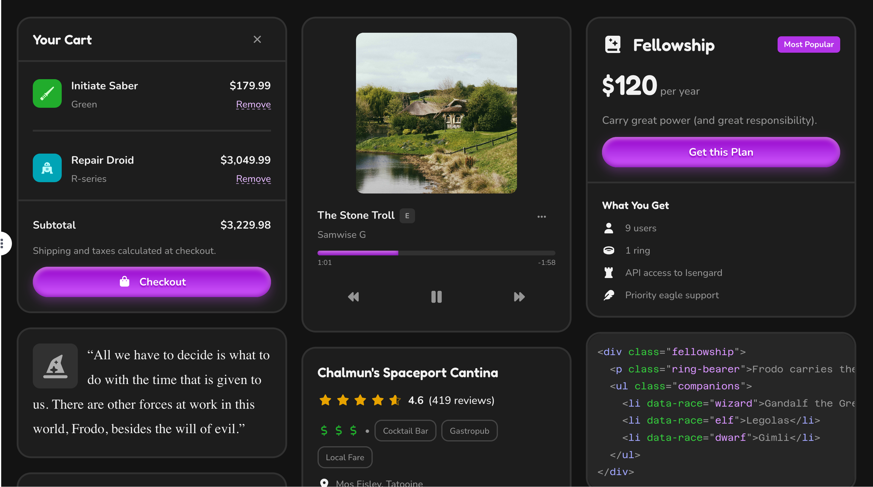
Awesome theme preview (light) Awesome theme preview (dark)
Awesome

Punchy and vibrant, the rock star of themes.

Shoelace theme preview (light) Shoelace theme preview (dark)
Shoelace

The original, familiar look you know and love from Shoelace.

Active theme preview (light) Active theme preview (dark)
Active ProThis theme requires access to Web Awesome Pro
Energetic and tactile, always in motion.
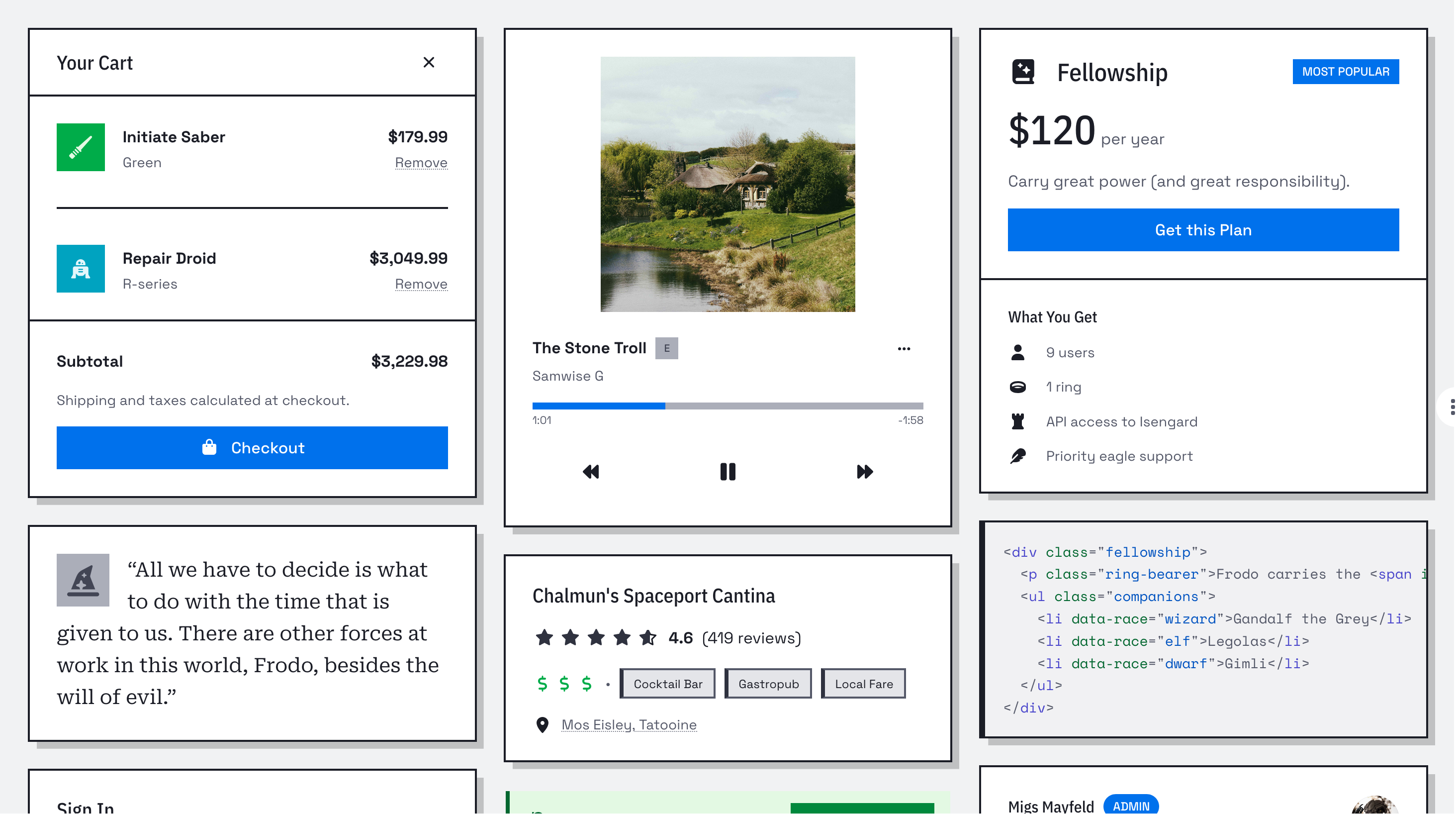
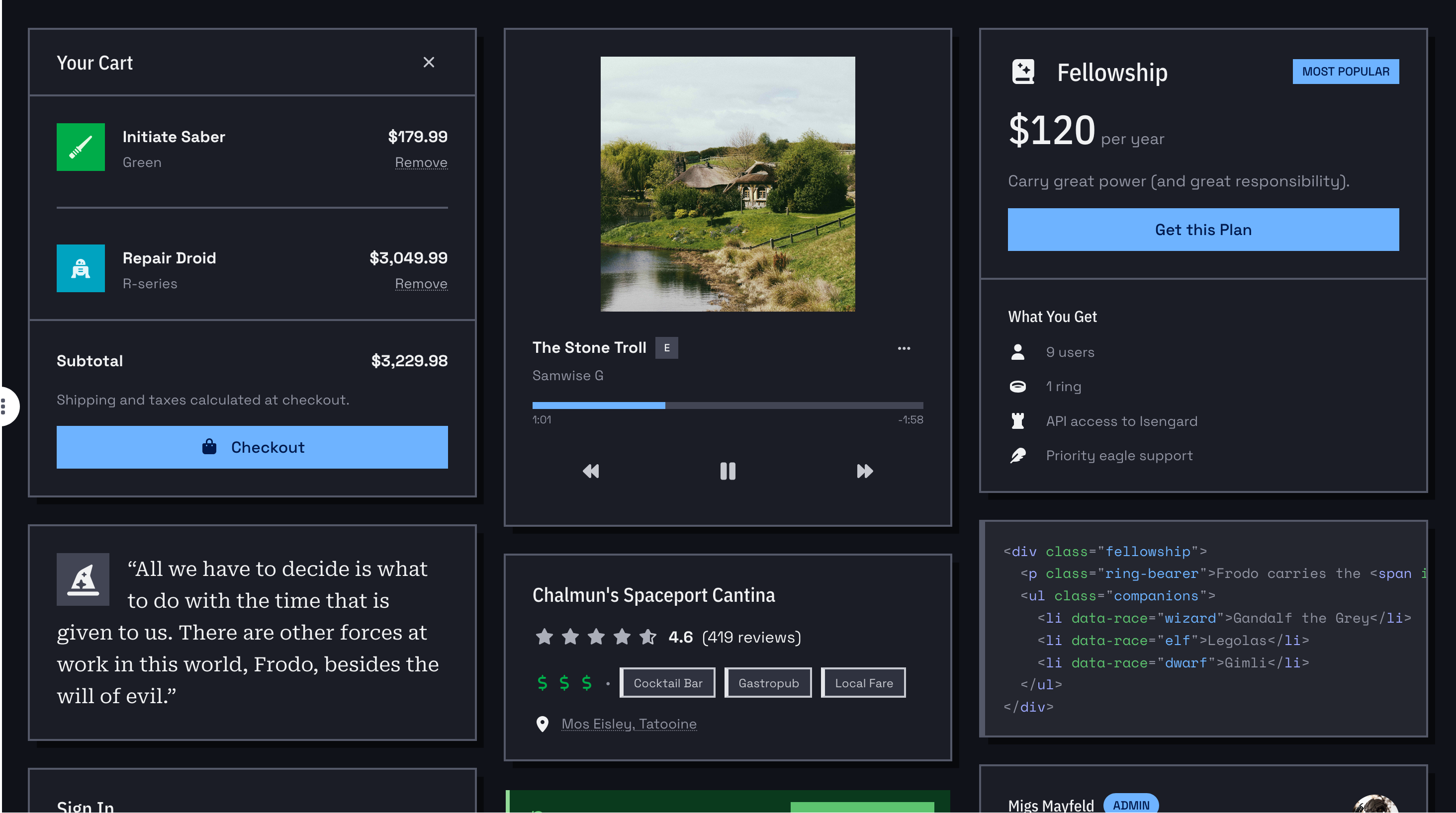
Brutalist theme preview (light) Brutalist theme preview (dark)
Brutalist ProThis theme requires access to Web Awesome Pro
Sharp, square, and unapologetically bold.
Glossy theme preview (light) Glossy theme preview (dark)
Glossy ProThis theme requires access to Web Awesome Pro
Bustling with plenty of luster and shine.
Matter theme preview (light) Matter theme preview (dark)
Matter ProThis theme requires access to Web Awesome Pro
Digital design inspired by the real world.
Mellow theme preview (light) Mellow theme preview (dark)
Mellow ProThis theme requires access to Web Awesome Pro
Soft and soothing, like a lazy Sunday morning.
Playful theme preview (light) Playful theme preview (dark)
Playful ProThis theme requires access to Web Awesome Pro
Cheerful and engaging, like a playground on screen.
Premium theme preview (light) Premium theme preview (dark)
Premium ProThis theme requires access to Web Awesome Pro
The ultimate in sophistication and style.
Tailspin theme preview (light) Tailspin theme preview (dark)
Tailspin ProThis theme requires access to Web Awesome Pro
Like a bird in flight, guiding you from there to here.

Your theme is determined by class="wa-theme-{name}" on the <html> element. If no class is specified, the default theme is used.

Browse Built-in Themes

Color Palettes

Link to This Section

.wa-palette-{name}

A color palette is the full set of 10 hues — red, orange, yellow, green, cyan, blue, indigo, purple, pink, and gray — each with 11 tints from 05 (darkest) to 95 (lightest), all available as color design tokens.

Each palette has its own hue shifts and chroma, so swapping palettes changes the entire feel of your project — especially alongside a theme and variant colors. Your palette is determined by class="wa-palette-{name}" on the <html> element; if no class is specified, the default palette is used.

Red
--wa-color-red-*
95
90
80
70
60
50
40
30
20
10
05
Orange
--wa-color-orange-*
95
90
80
70
60
50
40
30
20
10
05
Yellow
--wa-color-yellow-*
95
90
80
70
60
50
40
30
20
10
05
Green
--wa-color-green-*
95
90
80
70
60
50
40
30
20
10
05
Cyan
--wa-color-cyan-*
95
90
80
70
60
50
40
30
20
10
05
Blue
--wa-color-blue-*
95
90
80
70
60
50
40
30
20
10
05
Indigo
--wa-color-indigo-*
95
90
80
70
60
50
40
30
20
10
05
Purple
--wa-color-purple-*
95
90
80
70
60
50
40
30
20
10
05
Pink
--wa-color-pink-*
95
90
80
70
60
50
40
30
20
10
05
Gray
--wa-color-gray-*
95
90
80
70
60
50
40
30
20
10
05
Browse All Palettes

Variants

Link to This Section

.wa-{variant}-{hue}

Variants assign palette hues to five semantic roles — brand, neutral, success, warning, and danger — so components like buttons and callouts can convey meaning through color. Any hue from your palette can be assigned to any variant with class="wa-{variant}-{hue}". Apply the class to the <html> element to set variants globally, to a wrapper to scope them to one section, or to a single component to override just that element. For deeper customization, override the --wa-color-{variant}-* tokens in your own CSS.

Brand
--wa-color-brand-*
95
90
80
70
60
50
40
30
20
10
05
Neutral
--wa-color-neutral-*
95
90
80
70
60
50
40
30
20
10
05
Success
--wa-color-success-*
95
90
80
70
60
50
40
30
20
10
05
Warning
--wa-color-warning-*
95
90
80
70
60
50
40
30
20
10
05
Danger
--wa-color-danger-*
95
90
80
70
60
50
40
30
20
10
05
See Variant Tokens

Light & Dark Mode

Link to This Section

.wa-light .wa-dark

Every theme is designed to adapt to light and dark mode. Light mode applies by default; apply class="wa-light" or class="wa-dark" to set the color scheme on the page or any section. To invert sections, detect user preference, or apply dark mode automatically, head over to Customizing & Theming.

Light

Whipped cream Hershey's Kisses Jelly beans Make Waffles

Dark

Whipped cream Hershey's Kisses Jelly beans Make Waffles
<div class="wa-grid">
  <wa-card class="wa-light">
    <div slot="header" class="wa-split wa-color-text-quiet">
      <h4 class="wa-heading-s">Light</h4>
      <wa-icon name="sun-bright" variant="regular"></wa-icon>
    </div>
    <div class="wa-stack">
      <wa-input label="# of Waffles" type="number" value="3"></wa-input>
      <wa-select label="Toppings" multiple value="jelly-beans">
        <wa-option value="whipped-cream">Whipped cream</wa-option>
        <wa-option value="hershey">Hershey's Kisses</wa-option>
        <wa-option value="jelly-beans">Jelly beans</wa-option>
      </wa-select>
      <wa-button appearance="filled" variant="brand">
        <wa-icon slot="start" name="waffle"></wa-icon>
        Make Waffles
      </wa-button>
    </div>
  </wa-card>

  <wa-card class="wa-dark">
    <div slot="header" class="wa-split wa-color-text-quiet">
      <h4 class="wa-heading-s">Dark</h4>
      <wa-icon name="moon-stars" variant="regular"></wa-icon>
    </div>
    <div class="wa-stack">
      <wa-input label="# of Waffles" type="number" value="3"></wa-input>
      <wa-select label="Toppings" multiple value="jelly-beans">
        <wa-option value="whipped-cream">Whipped cream</wa-option>
        <wa-option value="hershey">Hershey's Kisses</wa-option>
        <wa-option value="jelly-beans">Jelly beans</wa-option>
      </wa-select>
      <wa-button appearance="filled" variant="brand">
        <wa-icon slot="start" name="waffle"></wa-icon>
        Make Waffles
      </wa-button>
    </div>
  </wa-card>
</div>

Using Dark Mode

Using Themes

Link to This Section

For tailored guidance, select your theme, color palette, and variant colors below, then follow the instructions for your preferred method.

Theme Options Pro Default Awesome Shoelace Active Brutalist Glossy Matter Mellow Playful Premium Tailspin Pro Default Bright Shoelace Rudimentary Elegant Mild Natural Anodized Vogue
Red Orange Yellow Green Cyan Blue Indigo Purple Pink Gray Red Orange Yellow Green Cyan Blue Indigo Purple Pink Gray Red Orange Yellow Green Cyan Blue Indigo Purple Pink Gray Red Orange Yellow Green Cyan Blue Indigo Purple Pink Gray Red Orange Yellow Green Cyan Blue Indigo Purple Pink Gray
CDN npm Self-Hosted Hosted Projects These options can only be used with a Pro subscription.

To use these choices, add the following stylesheets from the CDN:

<link rel="stylesheet" href="https://ka-f.webawesome.com/webawesome@0.17.0/styles/themes/default.css" />
<link rel="stylesheet" href="https://ka-f.webawesome.com/webawesome@0.17.0/styles/color/palettes/default.css" />

Then, apply the following classes to the <html> element:

<html class="wa-theme-default wa-palette-default wa-brand-blue wa-neutral-gray wa-success-green wa-warning-yellow wa-danger-red">

After installing @awesome.me/webawesome, import the following stylesheets:

import '@awesome.me/webawesome/dist/styles/themes/default.css';
import '@awesome.me/webawesome/dist/styles/color/palettes/default.css';

Then, apply the following classes to the <html> element:

<html class="wa-theme-default wa-palette-default wa-brand-blue wa-neutral-gray wa-success-green wa-warning-yellow wa-danger-red">

If you're self-hosting Web Awesome, include the following stylesheets from your server:

<link rel="stylesheet" href="/dist/styles/themes/default.css" />
<link rel="stylesheet" href="/dist/styles/color/palettes/default.css" />

Then, apply the following classes to the <html> element:

<html class="wa-theme-default wa-palette-default wa-brand-blue wa-neutral-gray wa-success-green wa-warning-yellow wa-danger-red">

Free Workspace Projects

Step Action
1 Go to your project's Settings.
2 For Theme, select .
3 For Color Palette, select .
4 Save your theme to immediately update anywhere you're using your project.
5 In your own files, apply the following classes to the <html> element:
<html class="wa-brand-blue wa-neutral-gray wa-success-green wa-warning-yellow wa-danger-red">

Pro Workspace Projects

Step Action
1 Go to your project's Settings.
2 Press Edit Your Theme to open the Theme Builder.
3 Open Theme and select .
4 Open Colors. On the Basic tab, select . On the Advanced tab, select your preferred variant colors.
5 Save your theme to immediately update anywhere you're using your project.

Creating Your Own

Link to This Section

You can build a custom theme with the Theme Builder to customize colors, fonts, roundness, spacing, and icons visually, or with custom CSS by overriding design tokens in your own stylesheet.

Quick Reference

Link to This Section
Task How To Learn More
Change my brand color Add class="wa-brand-{hue}" to <html> Changing Variants
Switch color palettes Load the palette stylesheet, then add class="wa-palette-{name}" to <html> Browse Palettes
Use a different theme Load the theme stylesheet, then add class="wa-theme-{name}" to <html> Built-in Themes
Toggle dark mode Add class="wa-dark" to <html> (or any section) Light and Dark Mode
Override a single token Define a --wa-* custom property associated with a design token in your own CSS Customizing With CSS
Go Make Something Awesome
Version 0.17.0 © Fonticons, Inc.
  • Terms
  • Privacy
  • Refunds
  • Core License
  • Pro License

Quick Links

  • Components
  • CSS Utilities
  • Theming
  • Using with AI
  • Changelog
  • Help & Support

Recent Searches

    D'oh! No results for “”

    Suggest on GitHub Ask on Discord
    Navigate Select
    Close Esc